• Graphic Design for Business
  • About Oxygin Design
  • Clients
  • Contact
Oxygin Design - Brand Creation - West Sussex, Bognor

Oxygin Design. Bringing ideas to life!

  • Graphic Design for Business
  • About Oxygin Design
  • Clients
  • Contact

Branding, Identity & Logo Design Explained

A logo is not your brand, nor is it your identity. Logo design, identity design and branding all have different roles, that together, form a perceived image for a business or product.

There has been some recent discussion on the web about this topic, about your logo not being your brand. Although this may be true, I haven’t seen any clarification of the differences between ‘brand’, ‘identity’ and ‘logo’.

What is brand?

The perceived emotional corporate image as a whole.

What is identity?

The visual aspects that form part of the overall brand.


What is a logo?

A logo identifies a business in its simplest form via the use of a mark or icon.

To explain this in more detail, let’s start at the top – the brand.


What is branding?

Branding is certainly not a light topic - whole publications & hundreds of books have been written on the topic, however to put it in a nutshell you could describe a ‘brand’ as an organisation, service or product with a ‘personality’ that is shaped by the perceptions of the audience. On that note, it should also be stated that a designer cannot “make” a brand – only the audience can do this. A designer forms the foundation of the brand.

Many people believe a brand only consists of a few elements – some colours, some fonts, a logo, a slogan and maybe  some music added in too. In reality, it is much more complicated than that. You might say that a brand is a ‘corporate image’.

The fundamental idea and core concept behind having a ‘corporate image’ is that everything a company does, everything it owns and everything it produces should reflect the values and aims of the business as a whole.

It is the consistency of this core idea that makes up the company, driving it, showing what it stands for, what it believes in and why they exist. It is not purely some colours, some typefaces, a logo and a slogan.

As an example, let’s look at the well known IT company, Apple. Apple as a company, projects a humanistic corporate culture and a strong corporate ethic, one which is characterised by volunteerism, support of good causes & involvement in the community. These values of the business are evident throughout everything they do, from their innovative products and advertising, right through to their customer service. Apple is an emotionally humanist brand that really connects with people – when people buy or use their products or services; they feel part of the brand, like a tribe even. It is this emotional connection that creates their brand – not purely their products and a bite sized logo.

What is identity design?

One major role in the ‘brand’ or ‘corporate image’ of a company is its identity.

In most cases, identity design is based around the visual devices used within a company, usually assembled within a set of guidelines. These guidelines that make up an identity usually administer how the identity is applied throughout a variety of mediums, using approved colour palettes, fonts, layouts, measurements and so forth. These guidelines ensure that the identity of the company is kept coherent, which in turn, allows the brand as a whole, to be recognisable.

The identity or ‘image’ of a company is made up of many visual devices:

▪ A Logo (The symbol of the entire identity & brand)

▪ Stationery (Letterhead + business card + envelopes, etc.)

▪ Marketing Collateral (Flyers, brochures, books, websites, etc.)

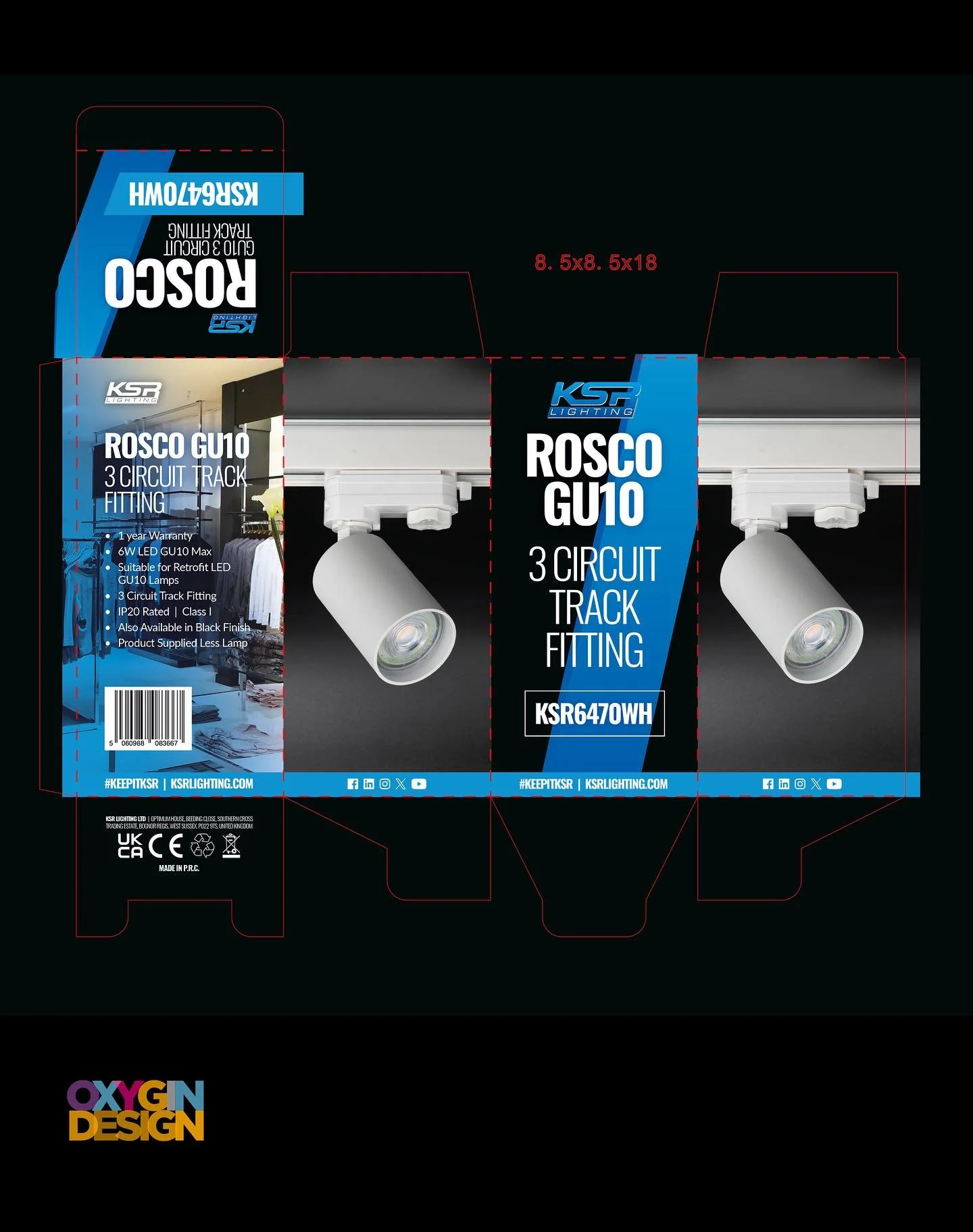
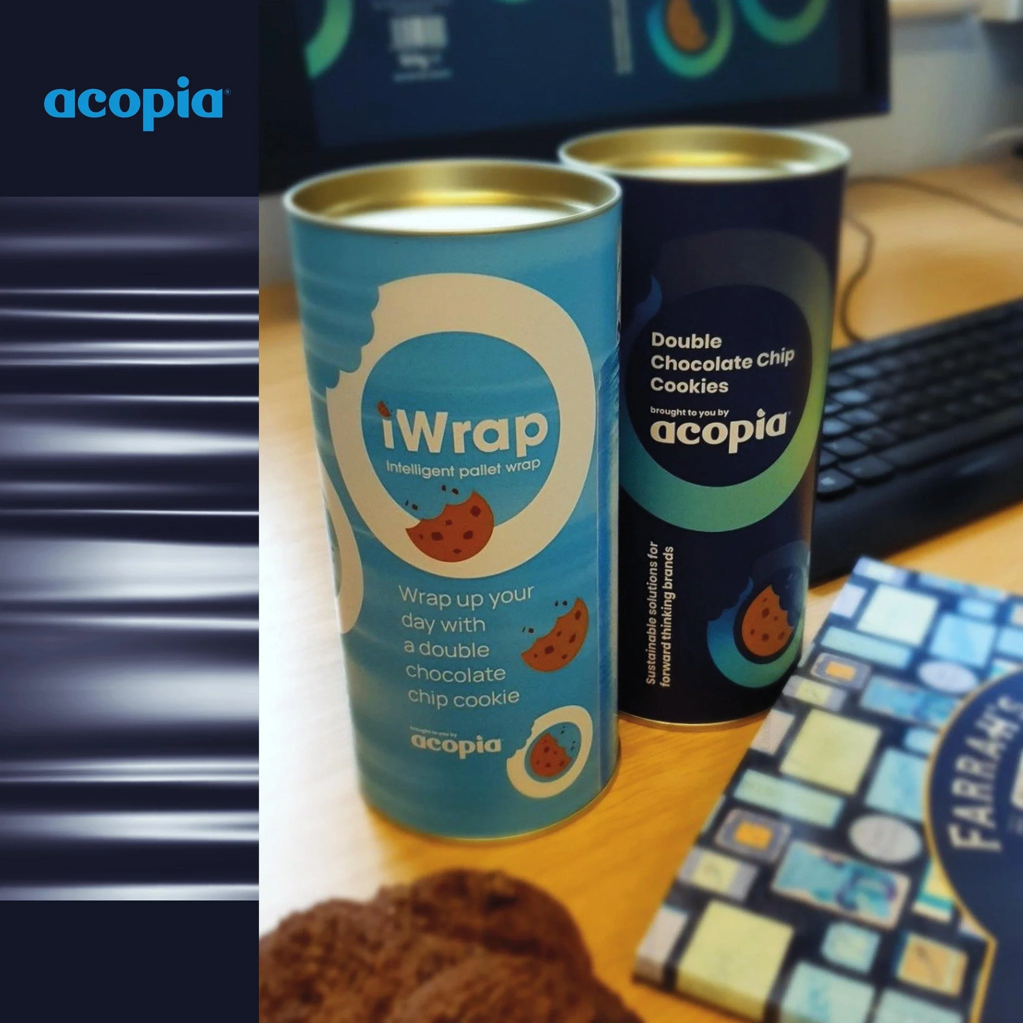
▪ Products & Packaging (Products sold and the packaging in which they come in)

▪ Apparel Design (Tangible clothing items that are worn by employees)

▪ Signage (Interior & exterior design)

▪ Messages & Actions (Messages conveyed via indirect or direct modes of communication)

▪ Other Communication (Audio, smell, touch, etc.)

▪ Anything visual that represents the business.

All of these things make up an identity and should support the brand as a whole. The logo however, is the corporate identity and brand all wrapped up into one identifiable mark. This mark is the avatar and symbol of the business as a whole.


What is a logo?

To understand what a logo is, we must first understand what it is for.

A logo is for… identification.

A logo identifies a company or product via the use of a mark, flag, symbol or signature. A logo does not sell the company directly nor rarely does it describe a business. Logo’s derive their meaning from the quality of the thing it symbolises, not the other way around – logos are there to identity, not to explain. In a nutshell, what a logo means is more important than what it looks like.

It is also important to note that only after a logo becomes familiar, does it function the way it is intended to do much alike how we much must learn people’s names to identify them.

The logo identifies a business or product in its simplest form.

Summary:

Brand – The perceived emotional corporate image as a whole.
Identity – The visual aspects that form part of the overall brand.
Logo – Identifies a business in its simplest form via the use of a mark or icon.

Post courtesy of : https://justcreative.com

tags: logo design, graphic design, branding
categories: Logo Design
Wednesday 10.16.19
Posted by Ginny Salmon
 

How to Spot a cheap Logo Design

1 – It’s Overly Complex

2 – It Lacks Versatility

3 – It’s Derivative

4 – It’s Forgettable

5 – It’s the ‘Wrong’ Colour

6 – It’s Brand-Inappropriate

  • Balance

  • Proximity

  • Alignment

  • Repetition

  • Contrast

  • Space

    Logo design that meets all of the six design principles isn’t a luxury, it’s a necessity for anyone trying to tell a story.

    It doesn’t take an experienced graphic designer to spot a cheap logo design - and the average consumer is savvier than you think.

    Keep in mind that your logo design represents your entire brand; it’s more than just a little image for your website or business cards.

    This symbol will be used to make a brand judgement quicker than you realise with images being processed 60,000 times faster than text.

    Many of the principles of graphic design are closely tied to the science of behavioural psychology.

    Even if your average consumer can’t communicate why your logo makes them feel embarrassed, disgusted, or confused, they’ll have a reaction.

    You probably know what you like (and dislike) when it comes to logos and graphics.

    Whether you’re considering rebranding or purchasing your first professional logo, here are some ways to evaluate how to spot a budget logo design.


1 - It’s Overly Complex

Just for one second, consider some of the world’s most recognisable logos. Did you just think of the McDonald’s “M”? the Nike swoosh? Or the Apple with a bite taken? All of these logos are really simple. Many famous logos are even revised to become even simpler.

What exactly spells out the difference between complexity and simplicity in logo design.
A confusing logo can be caused by the use of too many colours, detailed images, intricate fonts, or excessive superfluous elements. A logo with extraordinarily complex design doesn’t make your brand look high-class or fancy. It means your graphic designer didn’t understand the value of simplicity.

2 - It Lacks Versatility

”One of the most tragic and familiar hallmarks of truly cheap logo design is a lack of versatility.”
In today’s marketing culture, the ability for a logo to scale and appear attractive across multiple mediums is crucial.
Versatility in logo design means usage on smartphone, tablet and computer screens; print advertising and even billboards.

Adaptability is a critical filter to consider when creating a logo design, and far too many small business owners aren’t aware of the right limitations.

I recommend asking the following questions before you make a final selection, to avoid the need for total rebranding in the future:

• Can this logo be printed in a single colour? Just black and white?
• Is this logo’s message retained if it’s shrunk down to no more than 2 cm in either direction?
• Would the logo look too bland or boring if it were blown up to the size of a billboard? 

It would amaze you how many design concepts have to be discarded when you apply the filter of flexibility.
Exceptional logo design is usually complex enough to engage on a gigantic scale, and sufficiently simple to tell a story when it’s quite small.

3 - It’s Derivative

There are major trends in the fields of graphic design and branding, fuelled primarily by consumer demand.

All it takes is a visit to the facetious hipster logo generator to recognise a significant, recent pattern in how “cool” companies are branding themselves.

Should you ignore the latest graphic design trends, or avoid incorporating fleeting factors like Pantone’s colour of the year into your branding? - Almost certainly.

The world’s most beautiful and effective logos are almost timeless in their design. If your mission is to communicate your brand’s hipness factor, there are more efficient ways to do this than derivative design.

Take the example below of the BMW logo. Their original logo designed in 1916 hasn’t changed too much, only being occasionally refreshed stylistically to keep things fresh.

BMW-Logo-Design-History.png

4 - It’s Forgettable

The best logo designs in the world communicate an entire brand in one single glance.
Lego’s logo (pictured below) relays the idea of fun and childlike playfulness.
Mercedes Benz’s branding spells out luxury in nothing more than three lines and a circle.
The greatest logos have a story to tell, which is why they’re generally unique.

Legendary logo design expert Paul Rand once stated that the only hard and fast rules for logo design were to be:

Distinctive, memorable, and clear.

While it’s extraordinarily difficult to define memorable design, it’s certain to have a few factors. It’s likely to be slightly surprising, without jarring the viewer. It’s addictive and appealing to look at.
Ultimately, it’s going to be both original and familiar enough that it leaves the viewer wishing it was their idea.
Your brand has something valid and original to offer the world.

If your logo design looks like every other small businesses’ branding, you’re not communicating your unique value proposition.

5 - It’s the ‘Wrong’ Colour

Colours can be misrepresentative or ‘wrong’, even if they’re not “ugly” in their own right.

Professional logo design always considers colour theory, which is the science of how humans perceive various shades.

• Red: Importance, danger, anger and passion
• Orange: Energy, health, and vitality
• Yellow: Energy, hope, and cowardice
• Green: Abundance, growth, money, and new beginnings
• Blue: Responsibility, calmness, sadness
• Purple: Creativity, imagination, and royalty
• Black: Power, elegance, mystery, and formality
• White: Purity and cleanliness

Your logo’s primary and secondary colours should reflect who you are as an organisation.

A financial planning firm, for example, could come across as irresponsible with a yellow logo, while a decadent purple shade may not fit a health food brand.

6 - It’s Brand-Inappropriate

While colour theory is one of the most important ways logo designs tell stories, it’s far from the only factor.
Many experts believe there are approximately six principles of graphic design that affect how a design is perceived by a consumer.

These principles are:

  • Balance

  • Proximity

  • Alignment

  • Repetition

  • Contrast

  • Space 

All of the fundamental principles of graphic design work together, with the help of colour and typography, to communicate a message. If one factor is significantly off or ignored, your message will be obscured by poor design. And more likely than not, the result will be upsetting, confusing, or just plain cheap company logos. A poorly designed logo with insufficient contrast can be difficult for individuals with visual disorders to navigate. An imbalanced logo design upsets the natural human attraction to patterns. Proximity and alignment work to direct the viewers’ eyes appropriately.

Logo design that meets all of the six design principles isn’t a luxury, it’s a necessity for anyone trying to tell a story.

Rebranding is difficult. It’s challenging, expensive, and doesn’t always work. Even on massive budgets, there are some very high-profile cases of logo fails and rebranding disasters.

When purchasing a logo, your goal should never be to settle for the most affordable logo design packages you can get or to select something that’s going to need to be quickly replaced.

Knowing the reasons why some cheap logo design just looks inferior is a critical tool for marketing success.

 If you are looking for professional logo design on a budget, be sure to check our affordable logo design services go to : The Logo Design Page on this website.

If you wish to discuss how we can develop your brand or provide graphic design for your product or business, email us at: design@oxygin.co.uk


Blog post courtesy of : https://inkbotdesign.com/spot-cheap-logo-design/

Follow our Instagram Account to see just s few of our Logo Designs.

Hopefully getting back to normal soon! #businessbranding #logocreation #logorefresh #logodesign #brandingidentity #brandingchichester #brandingbognor #bognorregis #bognorregislogodesign #redesignlogo
Great to announce the brand new website for 'Five. Responsive Interiors' - In these times your office space or home office may need a complete rethink! Contact Helen for on the new site for more details. 👩‍💻 https://fivedesign.uk/

#websitecrea
A new stylish logo Identity for a local wheel builders. The brief was to keep the styling vintage. This is the result. A orange emblem which can be used for signage, digital, and print. This was created during lockdown as a new start up. Good thinkin
#thankyou #workingfromhome 🙂
Tara Wingrave, Telesales and Marketing - Brand new website design and creation with her new brand identity and colours. 
Check out her new site with ‘WhatsApp’ chat facility! 👩🏼‍💻#chichester #telesales #websitedesign #tarawingrave
I am very lucky to share an office with #BrightServe who deal with CRM systems and do all sorts of techie stuff. They provide an amazing work space and environment to work in. We have a great meeting room and lots of coffee and tea ☕️ for new clients
For everyone who’s left present buying until the last minute or just is not sure what to get that certain someone @seacombeandco have the perfect Christmas Gift! Beautiful Gift vouchers to get your hair on track!!🎄 #giftvouchers #christmas #se
You may need other elements to go with your logo identity. For example an icon which is recognisable on it’s own as part of your brand. Or a graphic to go with your designs to tie everything together. It’s so important that everything lin
Here it is, the chosen brand new identity for ‘Feefs’ The Travelling Afternoon Tea Company. The client had had two previous designers work on the identity but was not happy with the results. It was lovely to hear that the owner was &ldquo
Get your digital presence all on brand! PowerPoint Presentations, Word files, LinkedIn headers, Social Banners. They can all look great together giving a real professional look. 🙌🏽 #worddocs #powerpoint #branding #brand #aligolds #graphicdesign #on
Excited to finally have finished the Portsmouth Ice Skating Website - All ready for the Winter Season ❄️ ⛄️ @portsmouth_ice_rink 
#portsmouth #portsmouthiceskating  #iceskating #wesbite #websitecreation #portsmouthicerink #icerink #websitedesign #des
Still love this branding created for Suzi-B earlier this year. Suzi-B creates and presents some great retreats for stressed out mothers, fathers and those who would like to relax. Her latest retreat is on October the 14th @hunstonmanorhouse check out
tags: logo design sussex, logo design, logo design chichester, west sussex logo design, logo design west sussex, sussex logo design, graphic designer west sussex
categories: Logo Design
Wednesday 10.24.18
Posted by Ginny Salmon