• Graphic Design for Business
  • About Oxygin Design
  • Clients
  • Contact
Oxygin Design - Brand Creation - West Sussex, Bognor

Oxygin Design. Bringing ideas to life!

  • Graphic Design for Business
  • About Oxygin Design
  • Clients
  • Contact

The 80's Are Back Baby!

In all their tight-type, neon-colored, advertorial glory 

Words by Elizabeth Goodspeed

A New Balance advert from October 2021.

What are you seeing?

Layered, type-driven design inspired by 1980s advertising is on the rise, and along with it, a worthy opponent (finally) for the sleek, buttoned-up visual world of the last decade. In its purest iteration, the throwback ’80s editorial trend is text-heavy, with layouts comprised of a single, often silhouetted or gradient-backed image, a punchy headline, and supporting narrative copy. The most recognisable component of the trend is arguably its widespread use of condensed serifs like ITC Garamond Condensed or Editorial New - typefaces that just a few years ago would have been relegated to body copy, and certainly never run large as headlines with such tight tracking - as well as the occasional bold sans (a holdover from the Lubalin era) like ITC Kabel.

This aesthetic is most readily associated with 1980s advertisements by Apple, which pioneered the look with its launch campaign for the 1984 Macintosh, along with New Balance (Steve Jobs’ shoe of choice: a coincidence?) and car companies like Honda or Dodge. Arguably, this narrative approach to selling products can be traced back even further, to 1960s advertising titans like William Bernbach and David Ogilvy’s respective work for VW and Schweppes.

Macintosh Advert from the 1980’s.

1980s Honda Civic Advert

The current trend also includes an increase in visual motifs that cue physicality and real-world materials, even within brands that are exclusively digital. Think: film grain, VHS dithering, airbrush art, and faux paper backgrounds. This interest in throwback textures even extends to art direction and styling, with more photoshoots incorporating old-school tech like fax machines, cassette tapes, and brick phones as props (an occurrence mirrored in the adjacent return of low-fi 2000s tech like wired earphones). Like all trends of the “big flat now” that is 2022, the ’80s editorial aesthetic has many sub-genres and close cousins, ranging from neon script to monochrome euro-luxe. But, at their core, these offshoots are all unified by a mutual renewed interest in a balanced relationship between copy and image, as well as a return to tactility. 

Who’s using it?

The trend has mostly appeared in brand identity and campaign work, particularly in the fashion and lifestyle worlds (which always seem to hit on a new visual style before it trickles down to consumer packaged goods and tech). Eighties editorial style design has been seen in recent campaigns from Skims, Nike Yoga, and Amélie Pichard, as well as, unsurprisingly, in a slate of recent New Balance collaborations, including Aime Leon Dore, Casablanca, and Staud. Still emerging is the trend’s appearance in a few new food brands, like the just-launched Graza or bespoke beverage brand Lark. 

Why do designers love it?

Two years into a pandemic, and it seems like the collective ennui of isolated life has somehow led us headfirst into indulgence; ego is out, id is in, we’re smoking cigarettes and doing whatever the fuck we want, even while the world burns around us. As Michael Scanlon, chief creative director at Chandelier Creative, puts it: “From the looks of it on Instagram, everyone under 40 has ditched their reishi smoothies for caviar and martinis. And why not? It’s grim out there and we’re all craving a bit more pleasure and wit to make us feel alive again.” Looking back at the past 50 years, what could embody this mindset better than the 1980s—a time of vibrant nightlife and rampant consumerism, all set against the bleak backdrop of Reaganomics and the AIDS crisis.

“Everyone under 45 has ditched their reishi smoothies for caviar and martinis. And why not? It’s grim out there and we’re all craving a bit more pleasure and wit to make us feel alive again.”

On a functional level (this is a design publication, after all), it almost goes without saying that in 2022, refined minimalist design is thoroughly passé. So it’s definitely natural that the swing toward an ’80s aesthetic is part of the typical “20-year trend cycle” and a move back to a more maximalist, intentionally inexact approach to design as well. Maristella Gonzalez, art director at Ceremonia, also points out that Gen-Z is the demographic to target at the moment, and their decade-jumping obsessions with the ’80s, ’90s, 2000s, and, soon, the 2010s, is driving the return of everything vintage, from Joan Jett’s mullet to Ashley Tisdale’s bootcut jeans. It’s no surprise then that brands have realised creating a pastiche of any of these aesthetics is a sure-fire way to attract the attention, and dollars, of these younger potential customers.   

But while ’80s design is certainly resonating, it seems likely that nostalgia as a concept (rather than an explicit love of condensed serifs) is what’s really driving this resurgence. Designer Stefanie Brückler suspects that in response to a myriad of worldwide crises like COVID-19 and climate change, society is experiencing a collective yearning for the “better times” of the ’80s and early ’90s.

To her, “Millennials who had their early childhood in the ’80s, and those who experienced remnants of this era in the beginning of the ’90s, are yearning for places in their memory that feel safe, and remind them of parental love and protection.” It’s likely that these same Millennials, now 27 - 42 years old, are also at the helm of many of the creative teams tapping into this ’80s editorial aesthetic for contemporary branding and campaigns. For Gen-Z, who didn’t experience these decades firsthand, there’s still a deep romanticization of these periods (and their associated aesthetics) as simpler times, without cell phones and remote schooling.

From a brand strategy perspective, the editorialised advertising of the ’80s can also feel like a welcome change from the subtleties of social media spon-con. Rather than a winking, implied recommendation for a product, these editorial copy–driven layouts are advertisements with a capital A: this is what perfection looks like, and you can have it too. At a time when everyone wants a better life, maybe we’re just hoping that brands can tell us how to get one.  

Ref: https://eyeondesign.aiga.org/the-80s-are-back-baby/
Source: https://eyeondesign.aiga.org/the-80s-are-b...
tags: print, magazine print, Graphic designer Chichester
Thursday 05.25.23
Posted by Ginny Salmon
 

10 Tips for Becoming a Better Designer

I don’t think there’s a single designer out there that thinks he or she can’t get any better. Design and designers are constantly changing, growing and evolving. Some of it is technology, some of it is trendy; but all change starts with you.

If you want to be a better designer, you have to do something about it. Whether that’s learning something new, trying a different type of project, or thinking about feedback and criticism. Let’s start getting better, today!

1. Learn a New Technique or Skill

Growing as a designer starts with continued education. Whether formal or on your own, there are plenty of ways to learn a new skill or freshen up on a technique that you’ve been wanting to master.

Here are a few ways to get started:

• Take a class as a local college or online.

• Ask a colleague to show you how to do something he or she does well.

• Attend a professional training event or conference.

• Use online videos, or tutorials.

2. Take on a Fun or Personal Project

Sometimes the daily grid of work does not allow you to grow in the ways you want. (Maybe you’ve been wanting to test your hand in a minimalist style, but that’s not something your boss is interested in.) So take that concept on as a personal project.

Refresh or update your portfolio using a new style or technique or offer to help a friend with a small project. Some of these smaller, side projects are a great way to test out some of the ideas and techniques you want to experiment with in a more informal environment.

3. Read, Write or Pursue Other Creative Endeavours

To help keep your creative juices flowing, take part in other creative activities. Most designers agree that creativity comes fairly naturally. It is important to foster that part of your brain outside of work as well.

• Read a book

• Take photos

• Visit a museum

• Write or draw in a journal

• Listen to or make music

• Get out in nature

4. Collaborate

When you are working with other designers or any other coworkers, try to collaborate as much as possible. Sometimes we get too stuck doing our individual parts at our own desks and forget to see what else is happening around us.

Engage more in every aspect of a project. Learn what others are doing to contribute to the project and how to do it. You’ll get a better overall understanding of the complete process, respect the jobs of your teammates and maybe learn more about the process yourself. As many of us were told in school: There are no stupid questions.

5. Get Organised

This may sound overly simple: Get organised.

Organisation will help you feel relaxed and comfortable in your workspace and will help you work more smoothly and efficiently. It will give you extra time to think about projects, work on details and focus on the job (not where files are located).

If your desk or computer is already chaotic, this might seem a little daunting. But you can get organised in as little as a week by creating three sets of files (paper or digital) – current, finished (or to file) and throw out work bi-product. Create a system for keeps files in these folders (grouped by project) for easy access.

6. Set Goals that Will Challenge You

If you are not in the habit of setting design goals for yourself, start now. It often happens naturally in the annual review process where you work, but if not it is important to do it on our own.

Goals should be something achievable but challenging. Set deadlines for these goals and even a reward for yourself when the goal is met.

7. Create a ‘Cover’ of an Iconic Design

Sometimes you don’t know what you don’t know, right? That’s where this fun trick comes in. Create a “cover” design of something iconic. Try to replicate – adding your own design flair, of course, something that people know well.

Before you poo - poo the idea, here’s how it helps:

• It will make you design elements that you might not commonly use.

• It will help sharpen your skills for identifying and matching typefaces and colour.

• It will help you think about and recreate pieces of art.

• It will help you explore what works about the design you are covering and what does not.

• It will help you see trends and techniques that applied to certain periods and how they have changed over time and impacted the work you do today.

One little side note here: This is a design exercise for you to expand your creative thought. Don’t recreate a design for a project or plagiarise another designer’s work.

8. Focus on the Story

The best designs come from projects where the team really understands the story behind the final product. When you are thinking about the design, immerse yourself in the story of the brand or message of the project. Learn as much as you can about it before you even start to sketch out an outline.

And then tell that story with the design. (Every project has one; you just have to find it.)

9. Seek Feedback and Constructive Criticism

Ask for help and feedback regularly. In some environments this comes rather naturally. If you work as a freelancer or in a small office, it may not.

Constructive criticism and feedback should come from multiple sources:

• Employer or supervisor (if you have one)

• Clients

• Coworkers

• Peers and colleagues

• The design community

You may have to seek out this feedback. There are plenty of online resources to help; start with posting a portfolio and sharing the link. Behance appreciations and Dribbble shots are a good way to see what others think about particular projects.

10. Keep It Simple

Just as you would with the design itself, keep it simple when thinking about how to expand your horizons. You don’t have to quit your job and go back to design school to get better. Take small steps every day to refine your design skills.

You are already taking one step in the right direction by reading an article like this one. Reading about design and looking at what others are doing and saying about design will cause you to think about what you are doing and how it relates. Sometimes it is the little things that can make the biggest impact.

Conclusion

What have you done over the course of your career to improve you design skills? What do you plan on doing moving forward to continue to grow as a designer? These are questions every designer should ask internally every so often.

Just as design is constant changing so are the tools and techniques to create it. Continued learning and experimentation will help keep your skills fresh and your talent in demand.


Blog courtesy of: https://designshack.net

tags: how to be the best graphic designer, how to become a good designer, Graphic designer Chichester, graphic design west sussex
categories: Graphic Design, Print, Website Design
Friday 11.15.19
Posted by Ginny Salmon
 

Branding, Identity & Logo Design Explained

A logo is not your brand, nor is it your identity. Logo design, identity design and branding all have different roles, that together, form a perceived image for a business or product.

There has been some recent discussion on the web about this topic, about your logo not being your brand. Although this may be true, I haven’t seen any clarification of the differences between ‘brand’, ‘identity’ and ‘logo’.

What is brand?

The perceived emotional corporate image as a whole.

What is identity?

The visual aspects that form part of the overall brand.


What is a logo?

A logo identifies a business in its simplest form via the use of a mark or icon.

To explain this in more detail, let’s start at the top – the brand.


What is branding?

Branding is certainly not a light topic - whole publications & hundreds of books have been written on the topic, however to put it in a nutshell you could describe a ‘brand’ as an organisation, service or product with a ‘personality’ that is shaped by the perceptions of the audience. On that note, it should also be stated that a designer cannot “make” a brand – only the audience can do this. A designer forms the foundation of the brand.

Many people believe a brand only consists of a few elements – some colours, some fonts, a logo, a slogan and maybe  some music added in too. In reality, it is much more complicated than that. You might say that a brand is a ‘corporate image’.

The fundamental idea and core concept behind having a ‘corporate image’ is that everything a company does, everything it owns and everything it produces should reflect the values and aims of the business as a whole.

It is the consistency of this core idea that makes up the company, driving it, showing what it stands for, what it believes in and why they exist. It is not purely some colours, some typefaces, a logo and a slogan.

As an example, let’s look at the well known IT company, Apple. Apple as a company, projects a humanistic corporate culture and a strong corporate ethic, one which is characterised by volunteerism, support of good causes & involvement in the community. These values of the business are evident throughout everything they do, from their innovative products and advertising, right through to their customer service. Apple is an emotionally humanist brand that really connects with people – when people buy or use their products or services; they feel part of the brand, like a tribe even. It is this emotional connection that creates their brand – not purely their products and a bite sized logo.

What is identity design?

One major role in the ‘brand’ or ‘corporate image’ of a company is its identity.

In most cases, identity design is based around the visual devices used within a company, usually assembled within a set of guidelines. These guidelines that make up an identity usually administer how the identity is applied throughout a variety of mediums, using approved colour palettes, fonts, layouts, measurements and so forth. These guidelines ensure that the identity of the company is kept coherent, which in turn, allows the brand as a whole, to be recognisable.

The identity or ‘image’ of a company is made up of many visual devices:

▪ A Logo (The symbol of the entire identity & brand)

▪ Stationery (Letterhead + business card + envelopes, etc.)

▪ Marketing Collateral (Flyers, brochures, books, websites, etc.)

▪ Products & Packaging (Products sold and the packaging in which they come in)

▪ Apparel Design (Tangible clothing items that are worn by employees)

▪ Signage (Interior & exterior design)

▪ Messages & Actions (Messages conveyed via indirect or direct modes of communication)

▪ Other Communication (Audio, smell, touch, etc.)

▪ Anything visual that represents the business.

All of these things make up an identity and should support the brand as a whole. The logo however, is the corporate identity and brand all wrapped up into one identifiable mark. This mark is the avatar and symbol of the business as a whole.


What is a logo?

To understand what a logo is, we must first understand what it is for.

A logo is for… identification.

A logo identifies a company or product via the use of a mark, flag, symbol or signature. A logo does not sell the company directly nor rarely does it describe a business. Logo’s derive their meaning from the quality of the thing it symbolises, not the other way around – logos are there to identity, not to explain. In a nutshell, what a logo means is more important than what it looks like.

It is also important to note that only after a logo becomes familiar, does it function the way it is intended to do much alike how we much must learn people’s names to identify them.

The logo identifies a business or product in its simplest form.

Summary:

Brand – The perceived emotional corporate image as a whole.
Identity – The visual aspects that form part of the overall brand.
Logo – Identifies a business in its simplest form via the use of a mark or icon.

Post courtesy of : https://justcreative.com

tags: logo design, graphic design, branding
categories: Logo Design
Wednesday 10.16.19
Posted by Ginny Salmon
 

A Special Edition - The Homeworker Magazine

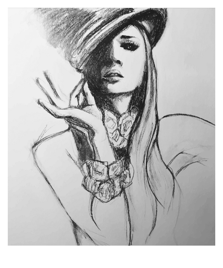
I have a little side hobby thing going on where I can be expressive with characters, illustration, sketches and drawings, it’s called ‘The Attic Design Studio’. With ‘Attic’ I can let go and create all sort of exotic and colourful imagery.

You can see some of my work from Attic on my little Etsy shop. All the artwork is sold as Giclée prints. https://www.etsy.com/uk/shop/AtticDesignStudioUK

It is always great to be recommended or appreciated in some way. But it is quite special to be chosen to feature on the front of a popular online magazine! So this happened… a few months back now, still I have only just found the time to write about it…

Moving on… I was approached through Instagram via one of the founders of The Collective (Networking Event in Chichester). To feature on the new online magazine ‘The Homeworker’.

It was great to be thought of and accepted as an artist in this way. The post on Instagram was announcing that ‘The Homeworker Magazine’ were looking for a local artist to feature on the magazine cover. With a new edition entitled ‘Money On The Mind’. The quarterly online magazine aims to help with advice for all types of freelancers, self employed workers and small business owners working from home for all or part of their week. It is full of knowledge for the modern day homeworker. ‘The Homeworker magazine’ has articles on lifestyle, motivation and work life balance when working from home. An essential tool to help you succeed when working from home. (Not as easy as everyone thinks).

The image which originally was chosen from my art archive to feature was my ‘Mysterious Lady’.

Photo by Greg Kadel, Model Anja Rubik

Photo by Greg Kadel, Model Anja Rubik

Originally ‘The Homeworker Magazine’s’ editor appreciated the above image. And she was chosen to feature on the front of the magazine, although it transpired that the image which had been drawn was too similar to the photo. So it was agreed for copyright reasons that we should abandon this drawing.

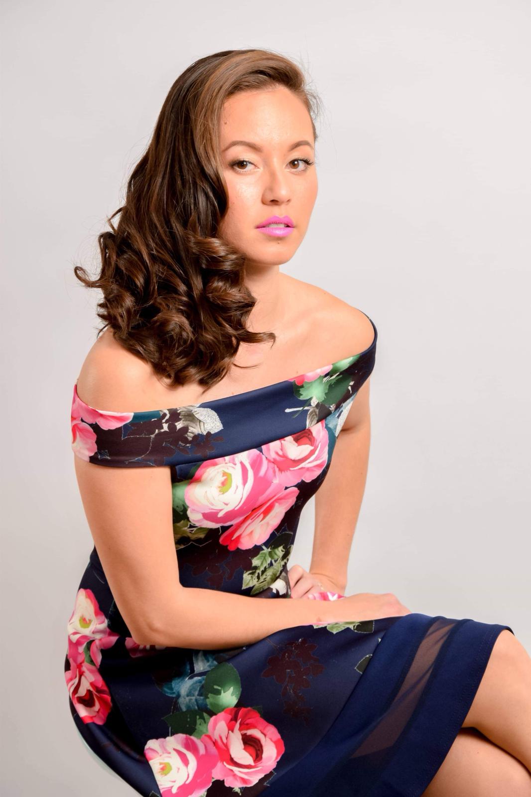
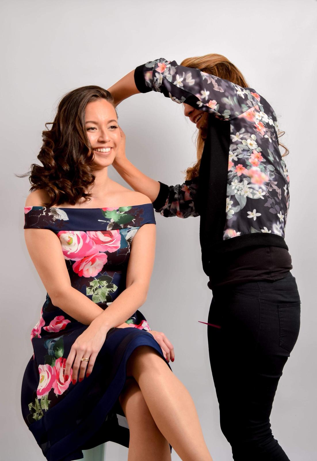
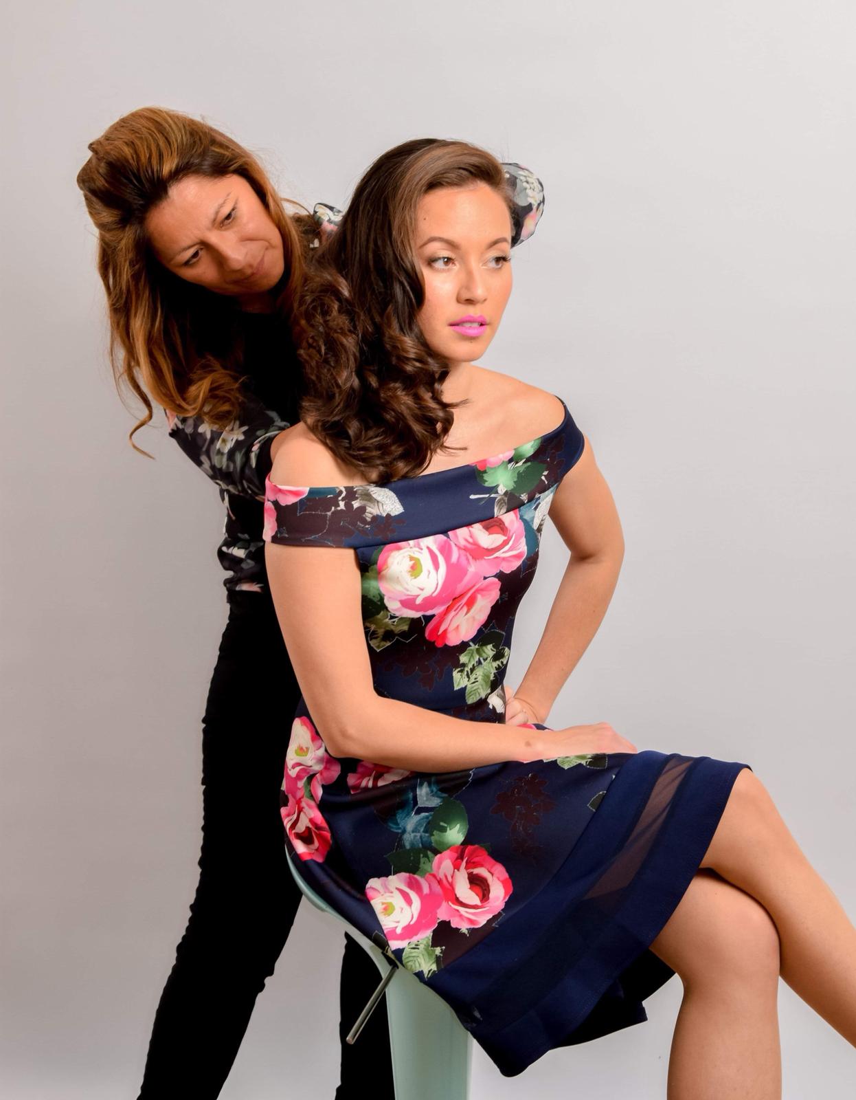
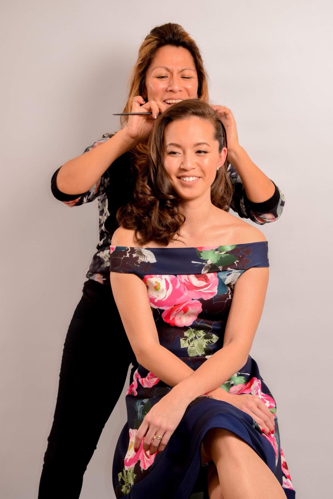
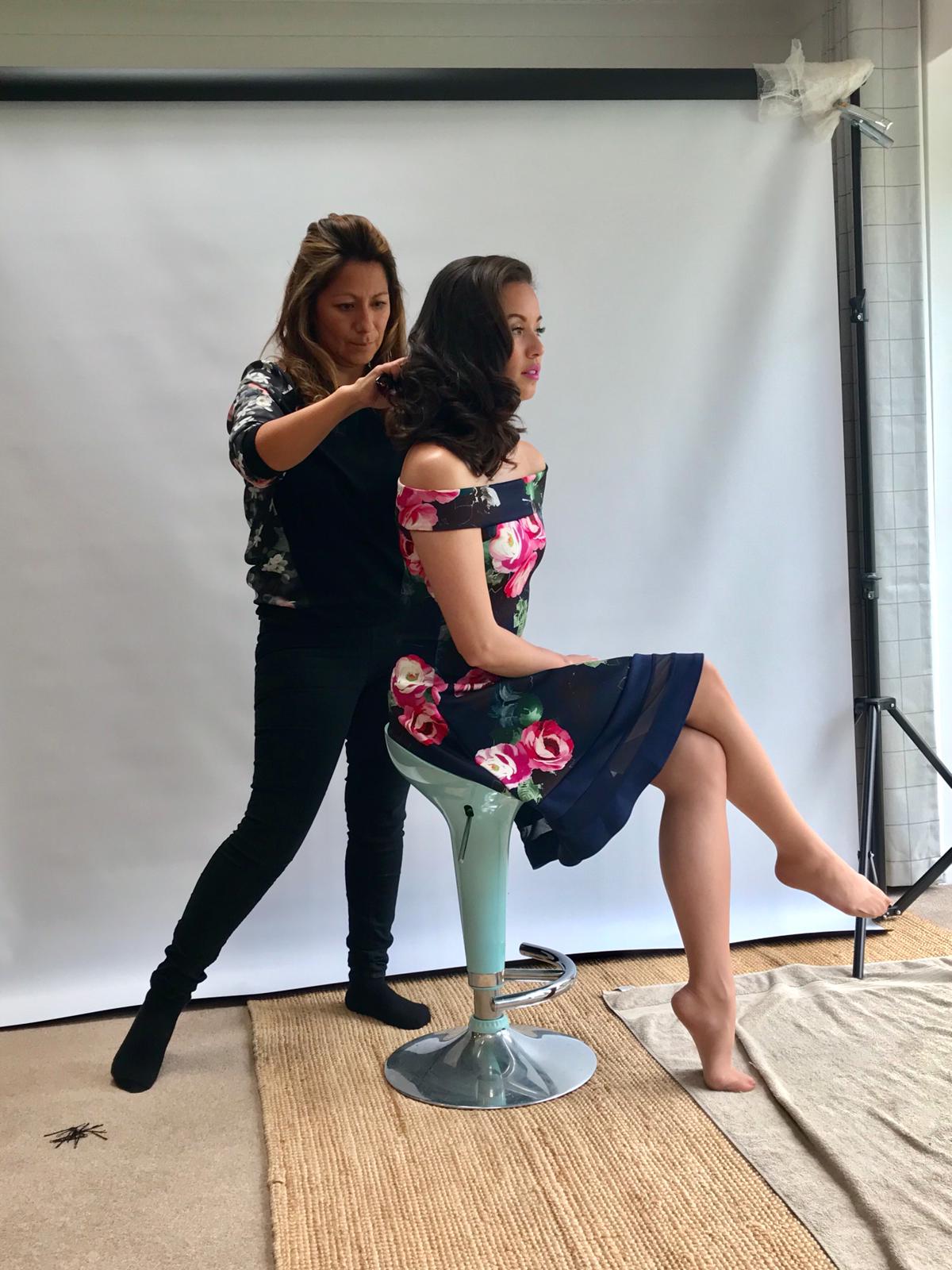
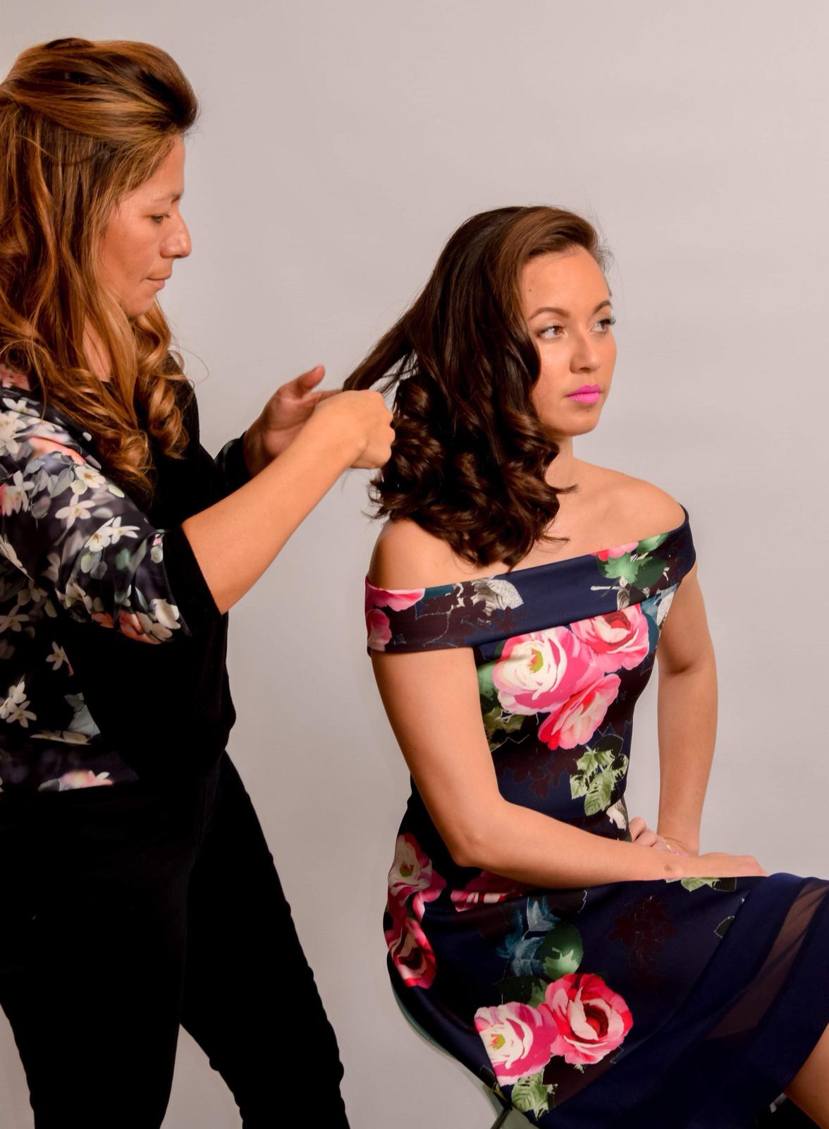
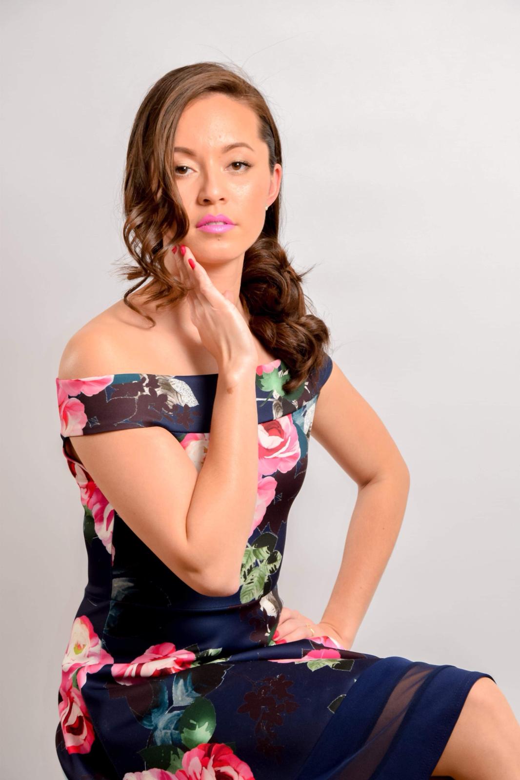
We had to go back to the drawing board… This lead on to our own photoshoot, creating our own image using our own model and photographer. So one grey Saturday in March sourcing some friendly assistance from KC Hair Boutique, Kiri make up and Berdene Kilbride Photography, we created a new image for the magazine. The image portrayed ‘The Money on the Mind’ title. So elegance, style and sophistication where key here! Helping to create the image maybe someone with money may look like. Here is a snap shot of some of the fun we had..

0fe5fcb4-7a3c-4a2e-aea8-a8708c05c009.JPG
3aebf74d-435e-4c49-a00c-cfb22c878f98.JPG
3d818256-f0b2-4812-97f2-37010c286e0f.JPG
4d82c510-dc8c-429a-8de3-3776d05a93c7.JPG
08e54369-ef01-4e3f-b6bf-cf9798d4a2ff.JPG
976d4fad-cfbd-4911-ab6b-570a95fe7b61.JPG
7916dff6-30c7-4f6d-a80d-7dc970c90f92.JPG
d2a1db2a-3e43-43b6-a83a-a95cf9ac0d15.JPG

So thanks to some great friends and professional experience this lovely photo was chosen.

kiri_small.png

Having chosen the perfect image the drawing and sketching commenced. Creating - Issue 002 - The Money Issue

Louise from The Homeworker Magazine loved this illustration. And what a beautiful cover, I am proud to have been involved in this project and to get the chance to arrange the photoshoot for the very helpful and informative Homeworker lifestyle magazine. It’s a great read for anyone thinking of going self employed or someone who already knows the daily struggles of being freelance.

Many thanks to everyone envolved.

Ginny

Monday 06.24.19
Posted by Ginny Salmon
 
Newer / Older